Relevant Overviews
Overview: Content Strategy
Are you creating the content your audience actually wants to consume, or are you just talking about yourself?
What sort of content will your audience read, out of the endless supply at their fingertips? Formal news articles or blog posts from your staff and readers? An event calendar updated daily, or a longread every month? Static web pages, or a deeply granular database with faceted search?
And have you figured out how to get it to them, develop engagement around it, and translate that success into something concrete, fulfilling your mission? How many of the friends and organisations in your network amplify your message regularly?
Need answers? Get in touch.
More services: start with Communication strategy.
Relevant resources
medium.com
We’re about to start testing new online designs to make scientific evidence more accessible to policymakers. Volunteers needed! - recruiting wireframe testers via K4P
Think
policy,
k4p,
usability,
web design,
content strategy,
information architecture,
evidence-based policy
medium.com

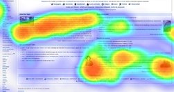
the primary battle many Content Strategists fight every day... While the boarding pass was the single most important thing to the passenger... it seemed to be the least important thing to the airline. The passenger became more frustrated with the airline with each passing offer and informational screen thrust in their way... We need to shift our …
uxplanet.org

The curse of knowledge is a cognitive bias that occurs when an individual, communicating with other individuals, unknowingly assumes that the others have the background to understand... seen at all levels of a company... if you already know the answer... tend to underestimate the difficulty of the question or the problem... become so immersed in t…
conversionxl.com

What’s the difference between customization and personalization? - Customization: The visitor deliberately chooses between options designed to make the user experience more personal.- Personalization: The visitor is automatically shown personalized pages based on anticipated needs / wants.
mathewlowry.myhub.ai
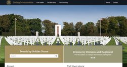
One of those projects you feel privileged to work on. It’s not often you get to experiment with crowdsourcing, augmented reality, faceted search and commemorating US war dead in one project.
digiday.com
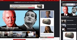
"Politico has redesigned its website for the first time in its seven year history, and The Guardian's U.S. recent refresh marks the first time it's redesigned almost entirely in public, with its readers' input. Here's a look at the thinking behind the redesigns, and what the publishers were able to pull off." - Politico, HBR, The Guardian: W…
www.fastcolabs.com

"Chartist is noteworthy because it doesn't just make existing charts smaller or bigger, it changes the the way the data is displayed so that it makes sense on whichever size screen it's being viewed on. A chart showing each of the 12 months along its x axis when displayed in a full-width browser window, for example, will change to show only six m…
www.niemanlab.org
"The Guardian released a beta version of its new website to get reader feedback as it continues to tweak its design.... Content discovery is a major focus ... “container model” allows the paper to implement a responsive design while also retaining a story hierarchy, user experience director... Each item contains a story, which are put together…
Like
web design,
science,
linkedin,
information,
audience research,
optimisation,
online architecture,
responsive,
survey
www.quicksprout.com
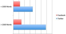
"The original converted 7.6% better than the new variation... The leads from the long form version of the page were better in quality ... in most cases long form copy doesn't just boost your conversions, but it also increases your rankings too." Indepth and (inevitably) long analysis. Huge feedback. - How Content Length Affects Rankings and…
www.niemanlab.org
"Two of the biggest trends in news today: the rise of mobile and the rise of data visualization. The unfortunate reality is that they’re often in conflict. ... If you want to do better, check out MobileVis ... Ros also pulls out a set of best practices for doing visualizations for mobile. Data visualization is good. Data visualization that works …
www.journalism.co.uk

The implications for CMS and responsive design of these "three key points to consider for adaptive storytelling" are potentially huge. - Advice for 'adaptive storytelling' from the Washington Post | Media news
moz.com

"There's no such thing as "perfectly optimized", but I took a stab at drawing up the mythical beast anyway: "... I first saw the "perfectly optimised page" infographic on Twitter, but discovered a much richer, larger article on Moz. In itself, this is a great use of infographics and data visualisation - the infographic stands on its and has bee…