Relevant Overviews
- Communication Strategy
- Content Strategy
- Online Strategy
- Social Media Strategy
- Content Creation & Marketing
- Online Architecture
- Digital Transformation
- Change & Project Management
- Innovation Strategy
- Communications Tactics
- Psychology
- Productivity
- Social Web
- Media
- Politics
- Communications Strategy
- Science&Technology
- Business
Overview: Content Strategy
Are you creating the content your audience actually wants to consume, or are you just talking about yourself?
What sort of content will your audience read, out of the endless supply at their fingertips? Formal news articles or blog posts from your staff and readers? An event calendar updated daily, or a longread every month? Static web pages, or a deeply granular database with faceted search?
And have you figured out how to get it to them, develop engagement around it, and translate that success into something concrete, fulfilling your mission? How many of the friends and organisations in your network amplify your message regularly?
Need answers? Get in touch.
More services: start with Communication strategy.
Relevant resources
www.sachinrekhi.com
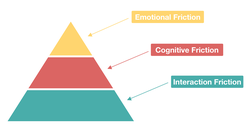
"User friction ... prevents a user from accomplishing a goal in your product... three levels: interaction friction, cognitive friction, and emotional friction"Interaction friction: do usability testing."When cognitive load is high ... there is significant cognitive friction ... encompasses all aspects of the experience that result …
medium.com
There are about 175 known cognitive biases to date. I will share some of the ones that I think are the most significant for designers... It is important that we not learn about biases to simply point out errors in others... we [need] to spot errors in our own thinking ...confirmation bias ... conservatism bias ... [influence us] to select and use …
uxplanet.org
This article is not a UX Research manual, it ... provides a general idea of how and when UX Research is conducted ... why designers should care about it...~ Understanding brings us closer to what we are already so familiar with. And that is the inception of UX Research... user research tackles the demographical data about a product’s existing and…
extranewsfeed.com

many activists working to create positive change ... seem to think that if they just get their ideas to “go viral” they will ... dominate the discourse. The great lie of this approach is that no singular discourse exists! Each community is now capable of building consensus with itself, where the like-minded talk to others like themselves while fo…
medium.com

we found that there were four ways the original disputed flags experience could be improved... Disputed flags buried critical information ... could sometimes backfire... Requiring two false ratings slowed down our ability to provide additional context and often meant that we weren’t able to do so at all.... We only applied Disputed flags to “fa…
medium.com
Be wary of using expert judgement as your only source of data... by all means apply your expertise to make judgments about a design, but be sure to validate these judgements with data... Hick’s Law ... states that the time taken to make a decision increases as the number of choices is expanded... Fitts’ law... the time required to rapidly move to…
mathewlowry.myhub.ai
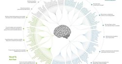
Yet another variation on the Top3ics format: exploring three facets of one topic, highlighting one outstanding resource (plus a few extra links) for each. Today’s theme... psychology
qz.com
thoughtfully designed user interfaces can make us a freer, more humane, and more just society, just as poorly designed ones seem to have made many of us less compassionate, less informed, and more antagonistic... for a case study, we only need to look ... online forum Nextdoor.com originally ... a way of fostering community through neighborhood-s…
www.ukauthority.com
The solution is in a new method of policy making with strong similarities to the agile approach ... “Policy making will be service design, and the designing of services will be the making of policy. Ideas and their implementation will be so close together... The way the law is made will have to change.
thenextweb.com

2015 is the Year of the Card. Screen-size cards are everywhere, from websites to native apps and are designed to look like their physical counterparts. It’s an easy way for you to shuffle through a series of digital containers with the flick of a thumb...cards are a style that seems just made for apps.
medium.com

While the platform has long been a bastion of visual storytelling, it has also been historically lax with its limitations on gratuitous writing and hashtagging. That all changed today... An epidemic of hashtag fatigue is coming... The first step was de-prioritizing the hashtag in discovery feeds. The next step is burying it in yours... To e…
blog.apps.npr.org
The visuals team ... the product of merging two groups: the news applications team, who served as NPR’s graphics and data desks, and the multimedia team, who made and edited pictures and video... The multimedia crew wanted to make pictures and video that were truly web-native, which required web makers. And our news apps lacked empathy... Pictu…
www.youtube.com
Masterclass time. From the Google Blog: we’ve taken the Google logo and branding, which were originally built for a single desktop browser page, and updated them for a world of seamless computing across an endless number of devices and different kinds of inputs (such as tap, type and talk).
rt.com

"A new interactive documentary, “The Fallen of World War II,” ... 18-minute film is styled like an infographic and that helps viewers fathom the scale of casualties in a way that simple numbers cannot.... The base elements it uses are simple human-shaped icons. Each of those represents one thousand deaths – and at some points in the video they …
www.fastcodesign.com
Good analyses of where data visualisation is heading: "Today, a slew of new software has made it easier than ever to create data visualizations from scratch. The downside? It has led to more prescriptive design. Take D3. It's a JavaScript library that helps turn information into any number of visual frameworks...Beyond D3... Tableau is the crow…
medium.com
"... infographics are often taken at face value... And it is hard to fact check infographics... Fast Company republished 10 facts from Buffer. Fact checking one of the facts in that list went like this: The fact quoted an infographic -> that quoted a blog post at Huffington Post -> which in turn quoted another infographic -> which quoted a blog…
thenextweb.com
"Images with text over them ... do make a post more enticing to your followers or friends... Buffer's Pablo, which creates these images, out of beta." - Buffer Officially Launches its Image Creation Tool Pablo
www.labnol.org
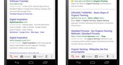
"Google is now clearly marking websites in mobile search results that it considers mobile friendly and if that tag isn’t getting displayed around your content, your website may see a drop in mobile traffic. Responsive design is definitely the way to go but will that be enough. How do you confirm if your web pages are considered mobile friendly by…
medium.com

"some people have the sense that data somehow makes designers less powerful, that you’re basing decisions based purely on mechanical measures rather than designer intuition and genius... data is what ... turns designers from artists into the most important decision makers in a company... prototypes can really only get you to local maxima ... the…
www.bbc.co.uk

With a very nice longform, multimedia html5 presentation to boot. "In this bustling environment, there is less news and more noise. ..." More news but even more noise, rather.
www.niemanlab.org
"Since Taylor launched an earlier version of the site at The Boston Globe in 2007, In Focus has known for longform photo storytelling, featuring huge, high-quality images.... If you’re pandering to social media, if you’re going for clickbait, it cuts away at any sort of storytelling." - Q&A: How Alan Taylor, online photography pioneer, is rethin…
www.fastcodesign.com
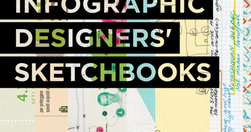
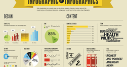
"The best infographics are clear, easy to digest, and eye-catching. But the process of distilling data into a neat little chart, bar graph, or venn diagram usually requires pages and pages of messy preparatory sketches, which are rarely seen by the public. Infographic Designers’ Sketchbooks ... take readers behind the scenes of the creative proce…
www.wired.com

"In this gallery are our favorite graphics of the year. " The Best Science Visualizations of the Year | WIRED
medium.com

"We are currently witnessing a re-architecture of the web, away from pages and destinations, towards completely personalised experiences built on an aggregation of many individual pieces of content ... the result of the rise of mobile technologies... from many pages of content linked together, towards individual pieces of content aggregated togeth…
om.co

"An image is the gateway to your emotional memory... And on the visual web an image is the gateway to accessing almost all content and information... we are adapting to a different kind of a web, one that will be increasingly visual... [but] the only available methods to surface and categorize photos are beyond basic; we need something intuitive…
gigaom.com

How much more could Google News be? See "... a presentation that a German designer came up with that involved a wholesale redesign and re-thinking of what Google News is and does." Lots of good stuff here. Particularly like how 'smart personalisation' is used to help penetrate the filter bubble: "automatically suggest related stories on a news t…
designschool.canva.com
what it says in the box - How to Create Amazing Infographics - Design School
medium.com

"Charted automatically visualizes data. Give it the link to a data file and Charted returns a beautiful, shareable visualization of that data... open-sourced and available for anyone to use at charted.co... it adjusts to any screen, automatically updates itself" - Introducing Charted - Data Lab - Medium
digiday.com
"Politico has redesigned its website for the first time in its seven year history, and The Guardian's U.S. recent refresh marks the first time it's redesigned almost entirely in public, with its readers' input. Here's a look at the thinking behind the redesigns, and what the publishers were able to pull off." - Politico, HBR, The Guardian: W…
www.nytimes.com
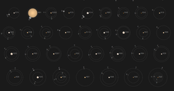
Kepler’s Tally of Planets is a wonderful NYTimes.com interactive feature: "NASA’s Kepler mission has discovered more than 950 confirmed planets orbiting distant stars. Planets with a known size and orbit are shown below" - Kepler’s Tally of Planets - Interactive Feature - NYTimes.com
Relevant Overviews
- Communication Strategy
- Content Strategy
- Online Strategy
- Social Media Strategy
- Content Creation & Marketing
- Online Architecture
- Digital Transformation
- Change & Project Management
- Innovation Strategy
- Communications Tactics
- Psychology
- Productivity
- Social Web
- Media
- Politics
- Communications Strategy
- Science&Technology
- Business