www.fastcompany.com
to investigate ... notion that websites are starting to look the same ... data mining ... scrutinized nearly 200,000 images across 10,000 websites... of the Russell 1000, the top U.S. businesses by market capitalization ... Alexa’s 500 most trafficked sites... sites nominated for Webby Awards ... how many pixel-by-pixel edits ... to transform colo…
medium.com
Here’s a quick overview on the four different primary forms of design to help you understand what they mean.
medium.com
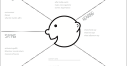
Empathy mapping is a way to characterise your target users in order to make effective design decisions. User journey mapping is a way to deconstruct a user’s experience with a product or service as a series of steps and themes. Put simply, these methods encourage your stakeholders to think about user needs effectively,
www.journalism.co.uk

The news organisation has mostly been focusing on revamping its mobile apps, but the next step is bringing some of the learnings back to the homepage... third in a series looking at how news organisations are now approaching the homepage, after it was pronounced dead by many in 2014... our real challenge everyday is to come in and say 'ok, who…
thenextweb.com
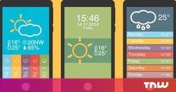
2015 is the Year of the Card. Screen-size cards are everywhere, from websites to native apps and are designed to look like their physical counterparts. It’s an easy way for you to shuffle through a series of digital containers with the flick of a thumb...cards are a style that seems just made for apps.
qz.com
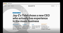
Our first attempt devoted much of the homepage to a continually updated news briefing. We are dispensing with that briefing today to try something else. Homepages, it turns out, aren’t dead so much as reborn.
medium.com

information architecture has become ripe with myths... I want to take a few moments to dispel some of them.... People convince themselves that information architecture is about organising content in a logical way. It is not... people aren’t logical.... users need to be able to reach content in three clicks.... there is no evidence to support…
medium.com
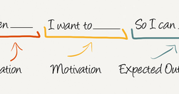
Job Stories are great because it makes you think about motivation and context and de-emphasizes adding any particular implementation. Often, because people are so focused on the who and how, they totally miss the why. When you start to understand the why, your mind is then open to think of creative and original ways to solve the problem. - Repl…
alistapart.com
" Top tasks are the small set of tasks ... that matter most to your customers. Make these tasks work well, and you’ll be on the right track. Get them wrong, and chances are you’ll lose the customer. Top Tasks Management is a model that says: “Focus on what really matters (the top tasks) and defocus on what matters less (the tiny tasks).” Tiny ta…
medium.com
"By news homepage, I mean any way for a user to first encounter content. A push notification could very well be the new news homepage. ... An article or a newsletter ... Overcast or Soundcloud or iTunes may be your homepage.... Homepage, to me, is simply a shorthand version for any of these things. " Neat overview. Just remember, however you desi…
intranetdiary.co.uk
Great article on improving intranet UX, and useful inspiration for any website manager: "During the online cardsorting sessions I covered over 1000 content items and got nearly 36,000 individual responses. The first batch ... designed to elicit our main navigation labels. Subsequent tests then checked that the chosen names would suit all the intr…